Gordon Christie

gordonchristie.com

Upgrading to EdinBus 3

A massive update for EdinBus is coming. I’ve been working on it for quite some time, and it takes advantage of new features available only in iOS 5.

If you have an original iPhone, iPhone 3G or an iPod Touch 1st or 2nd generation, you can still run the existing version of EdinBus, but you should take a backup of the app in iTunes in case it gets overwritten and you need to restore it.

All-Caps Design

I recently spotted this post from Microsoft, on their choices on menu design in Visual Studio:

Using uppercase for the menus was not an arbitrary decision, and I think it will help the discussion to frame why we made this change.

We’ve chosen to use uppercase styling in the top menu for two main reasons: 1) to keep Visual Studio consistent with the direction of other Microsoft user experiences, and 2) to provide added structure to the top menu bar area.

1) is a bit worrying, if it’s due to be propogated through Windows 8 and beyond – the choice of a single background colour for the entire upper area of the window means that this kind of problem will crop up frequently in Windows 8 UI design.

The main problem with 2) is that it’s a hack, created to solve a problem which has been entirely created by the surrounding design. If you look at the screenshot in before, you’ll see that the menu items do indeed fade into the background. There are several reasons for this:

  • The top area of the window is very busy because of the icon toolbar directly below the menu bar – many click targets are concentrated in one area
  • The icons are the only non-monochrome elements in the area, distracting attention from the menu items
  • This is compounded by the lack of background colour anywhere in the area, which means that these distinct areas (window bar, menu items, toolbar buttons, and to a lesser extent editor tabs), visually blur together

This leads to the decision in after to use caps to emphasise the menu, so it doesn’t get lost. The “Quick Search” off to the right has been moved upwards as well, although this isn’t really the problem.

This choice is seemingly forced upon Microsoft in order to match a new unified Metro “style”, although I’ve been unable to find anything official on Windows 8 desktop UI guidelines. This choice leads to compromises that are worse in usability terms (and aesthetic terms!) than the elements they replace.

There are several alternatives that wouldn’t involve using ugly all-caps items:

  • use a different tone of grey in the background for the menu and window bar, emphasising the difference between the menu and the toolbar
  • remove the toolbar items, or move them to another area of the interface, reducing the visual clutter (e.g. move to the bottom of the editor area)
  • adding lines between at least one or two of these areas would help to differentiate between them

Crafting the UI for an IDE is a great opportunity for Microsoft. When creating new UI elements and styles, the OS provider has a strong obligation to lead by example, especially in a tool which all Windows developers will use. And an IDE gives a great opportunity to see how design guidelines hold up in the face of a complex, real-world UI.

There is a significant emphasis on Metro style apps in Windows 8, but I think that if there is going to be a desktop environment, it should be well thought through.

When the solution to a problem is to create something which is worse in both appearance and functionality, maybe this isn’t the problem they should be trying to solve.

HTC Rhyme

I recently attended an event in Edinburgh where O2 and HTC were showing off Android mobile phones; the 4.3” HTC Sensation XE, the 4.7” HTC Sensation XL, and the 3.7” HTC Rhyme. I was offered the choice of the three to take home and play with, and I decided to go with the mid-range Rhyme. I’ve been using it a fair bit for the last couple of weeks.

My own experience of Android is limited, so I’m pleased to have the opportunity to try something relatively recent.

Of course, I’ve been primarily using iOS for the last few years, so bear that in mind as I describe my experiences.

New Site

I’ve had a presence on the Internet now for about fourteen years, and I’ve had this domain for ten years this week. I had a very terrible website in 1996 courtesy of my university account, and my own blogging (or “diary”, since the term hadn’t been coined at the time) started in early 1999 and continued very sporadically as the years progressed. This first diary was created using HTML manually.

Around that time, I was intrigued by XSLT and the ability to write a post once, then transform it into different versions based on client (e.g. HTML, WAP, etc). However I ended up using and embedding Livejournal quite soon after that, so never did create what would probably have been an XML monstrosity.

For gordonchristie.com, I’ve recently been using Squarespace, and it works very well. However it is somewhat overpowered for what I need, and is quite expensive. It also has no mobile version.

I’m instead using Octopress for blogging, on a Linode host. I’ve heard good things about it, and it has nice features (in particular, the mobile first, responsive web design).

I’m looking forward to seeing how it performs.

Chillypea

I’ve been quite busy lately, but I finally managed to finish a first version of my professional website.

The name of my company is Chillypea.

Chillypea is my professional identity - in addition to development and consultancy, I have some pretty nifty stuff coming up that I hope I can share with you soon.

EdinBus 2.3

EdinBus 2.3 for iPhone (iTunes Link) is out!

The biggest addition is a healthy dose of extra data from the good folks at mybustracker.co.uk. Stop directions are now shown on the map, and stop names are no longer truncated.

Also included are some fancy new iPhone 4 retina display graphics. In app graphics are all enhanced, and there’s a new sharper icon for iPhone 4 and iPad. No longer will you have to keep a fuzzy icon on your home screen!

Oh, and the EdinBus bus has some new livery to match Lothian Buses’ new paintwork in “madder” and white.

Behind the scenes there’s some new database generation code thanks to Niall Scott, which will make updates in future much faster. (Niall has an Android bus tracking app you should check out if you’re that way inclined)

More is in the works for EdinBus.. Watch this space!

New Beginnings

Today is a pretty big day for me. I have handed in my notice at my current job at the SQA, and in a month I’ll begin working as full-time on iPhone, iPad, Android and user interface consultancy.

It’s a pretty big transition, but this is the work I love. My work on EdinBus and other projects outside of my full-time job have been very fulfilling.

I’m glad to have the opportunity to do what I love for a living.

The website will be updated shortly with more information, but in the meantime if you have any queries about potential projects or availability, please email “me at this domain” and we can discuss it.

iPad Arrival

My long awaited iPad arrived today. I’ve been setting it up and playing with a few applications.

So far I’m genuinely impressed. A few iPhone only applications need to be updated (such as EdinBus!) but the whole thing works very seamlessly.

Air Video is great, as is LogMeIn Ignition. Instapaper is lovely, too. I’m very pleased with Twitteriffic. Hoping for a version of MarsEdit at some point.

iPad Preview

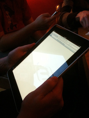
Last night, I had the opportunity to play with an iPad.

Just some random thoughts:

The iPad is fast. The only thing I saw slowing it down was very large webpages, and even that didn’t slow it down much.

The screen is brilliant. It’s clear, bright, and has a surprisingly large viewing angle. Glass screen is a fingerprint magnet, but cleans with a quick wipe.

It’s got a fair bit of heft to it. It feels like a solid single piece. Feels good in the hands.

We spent all evening playing with it continuously and the battery dropped about 20%. Bodes well for all-day usage.

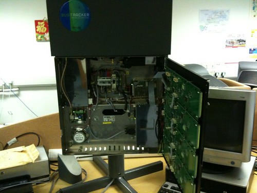
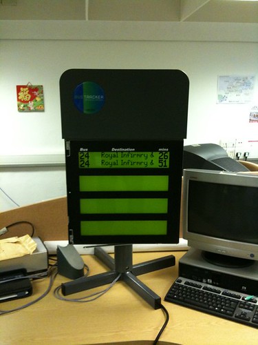
EdinBus looks silly at 2x on the large screen. Might need to investigate a universal app.

The virtual keyboard is better than I thought it’d be. I saw the owners typing pretty quickly, and I wasn’t far behind in speed. Landscape keyboard was easier than portrait (my hands aren’t quite big enough to use two thumbs on the portrait keyboard, but I saw others doing so with ease).

A fair bit of time last night was spent with four or five people sat around a table, with the iPad flat on the surface. It was surprisingly usable in that position. Played a couple multiplayer games that way. Screen rotation is smooth and fast, too. It’s awesome showing someone something by just flipping the pad over in your hands.

The applications I saw were mostly quite well thought through UI-wise, especially those from Apple. Popovers are great. Some UI bits were a bit clunky, but I suspect that situation will improve now developers have their hands on actual hardware to test.

I was sincerely impressed. It’s the right size and form factor to use for several situations where a full-size laptop might be awkward (e.g.plane/train/bus seat, or in bed).

I was planning to get one at the end of April; now I am impatient for it to arrive.

Bus Stop Signs

Ever wonder what the inside of an Edinburgh bus tracking sign looks like?

This is actually a special sign that speaks times, being tested at the council right now.

Had a very productive meeting with the council and an Android developer, Niall Scott, who is working on an Android bus tracking application for Edinburgh. I’ll post more about it when it goes live.